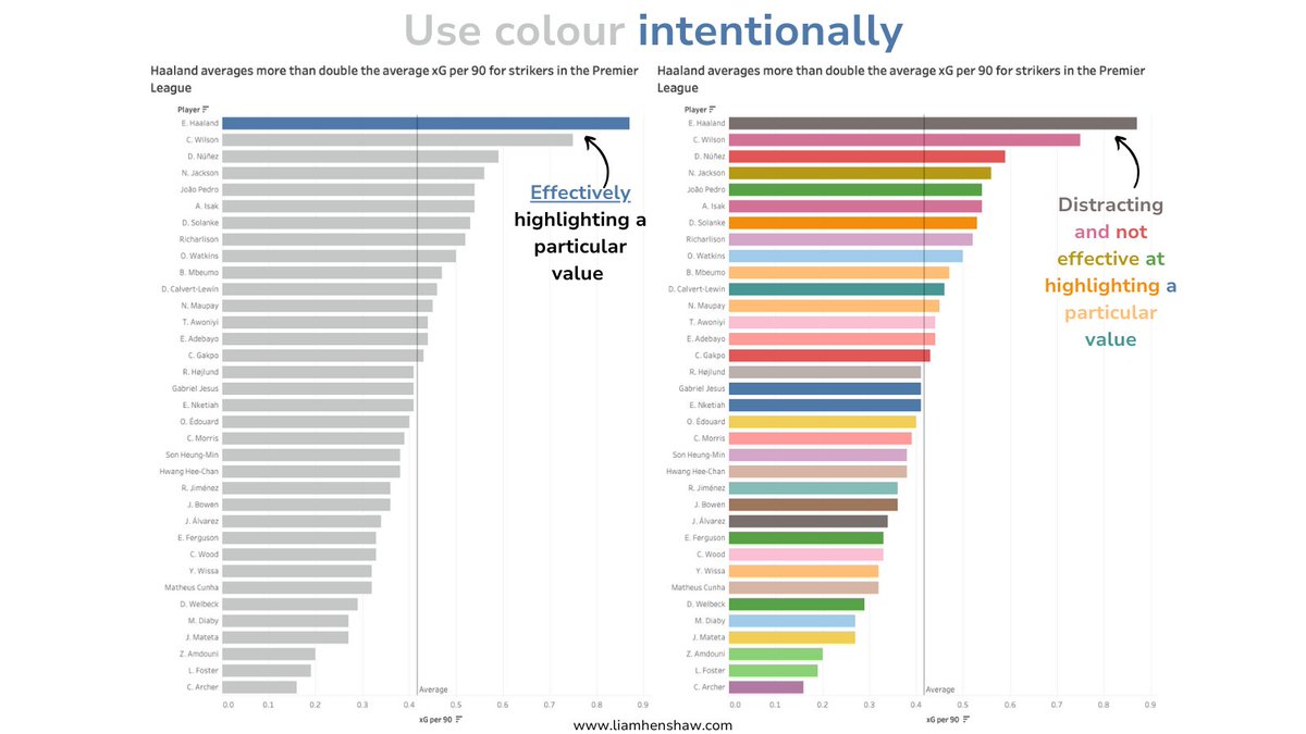
Effective use of colours in data visuals is crucial. However, many people struggle with this. Here’s how to make your data visuals more attention-grabbing:

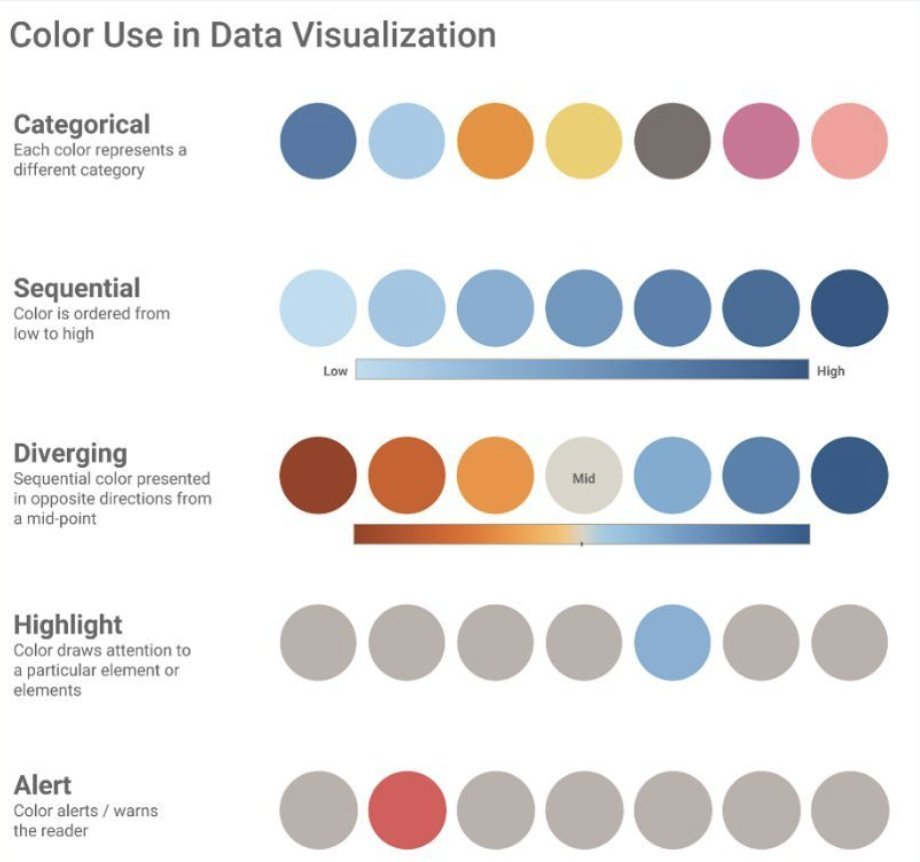
1/ There are five main ways to utilise colour in data visuals: - Categorical - Sequential - Diverging - Highlight - Alert

2/ Categorical: Use this method to represent distinctions between categories or groups in the dataset. For example, consider a chart with shades like blue, orange, yellow, and pink, where each colour represents a different competition.
3/ Sequential: This method is ideal for displaying values in order, typically from low to high. For example, a gradient of blue can range from light to dark. Lighter shades represent lower values, while darker shades indicate higher values.
4/ Diverging: Visualise values diverging from a central point, especially when there's a crucial midpoint. For example, a percentiles chart might use colours like red to white (midpoint) and then to blue. This represents data that diverges from a significant central value.
5/ Highlight: Use this to emphasise specific elements or data points. For example, amidst a backdrop of muted shades, a single vibrant colour stands out, directing focus to a particular data point, usually a value that is significant or positive.
6/ Alert: This is similar to the above but is used to signify caution. For example, a standout red among other colours indicates risk or alert-worthy information.
7/ Strategic use of colours in data visualisation is crucial. It transforms complex data into an easy-to-understand and engaging format. Choosing the right colour palette is essential for both effectiveness and accurate representation.
8/ Enjoy this? Share it with your network and follow me @HenshawAnalysis. Also subscribe to my weekly newsletter Scouting Spotlight, perfect for aspiring scouts and analysts, delivered every Monday morning: https://t.co/b94HNJYgE3
Effective use of colours in data visuals is crucial.
— Liam Henshaw (@HenshawAnalysis) September 5, 2024
However, many people struggle with this.
Here’s how to make your data visuals more attention-grabbing: pic.twitter.com/YIzYWUL1Ss

